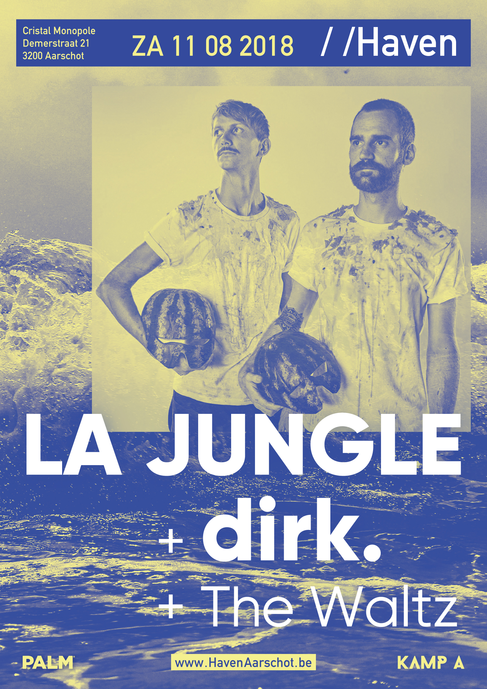
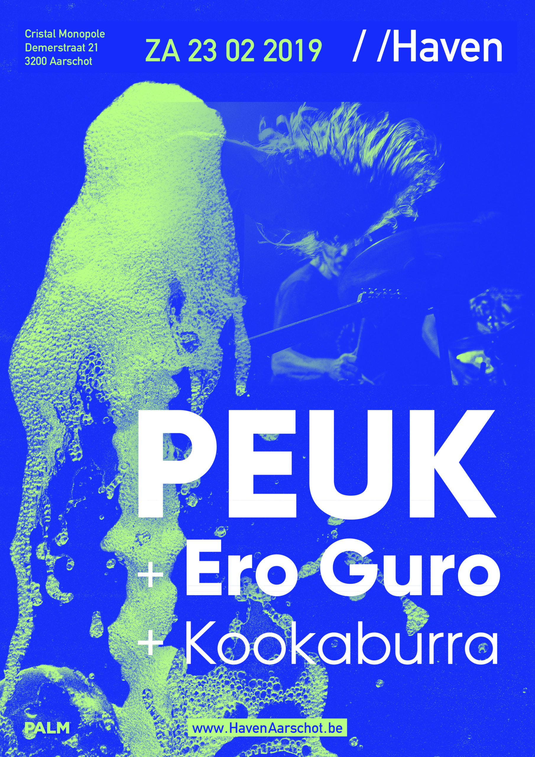
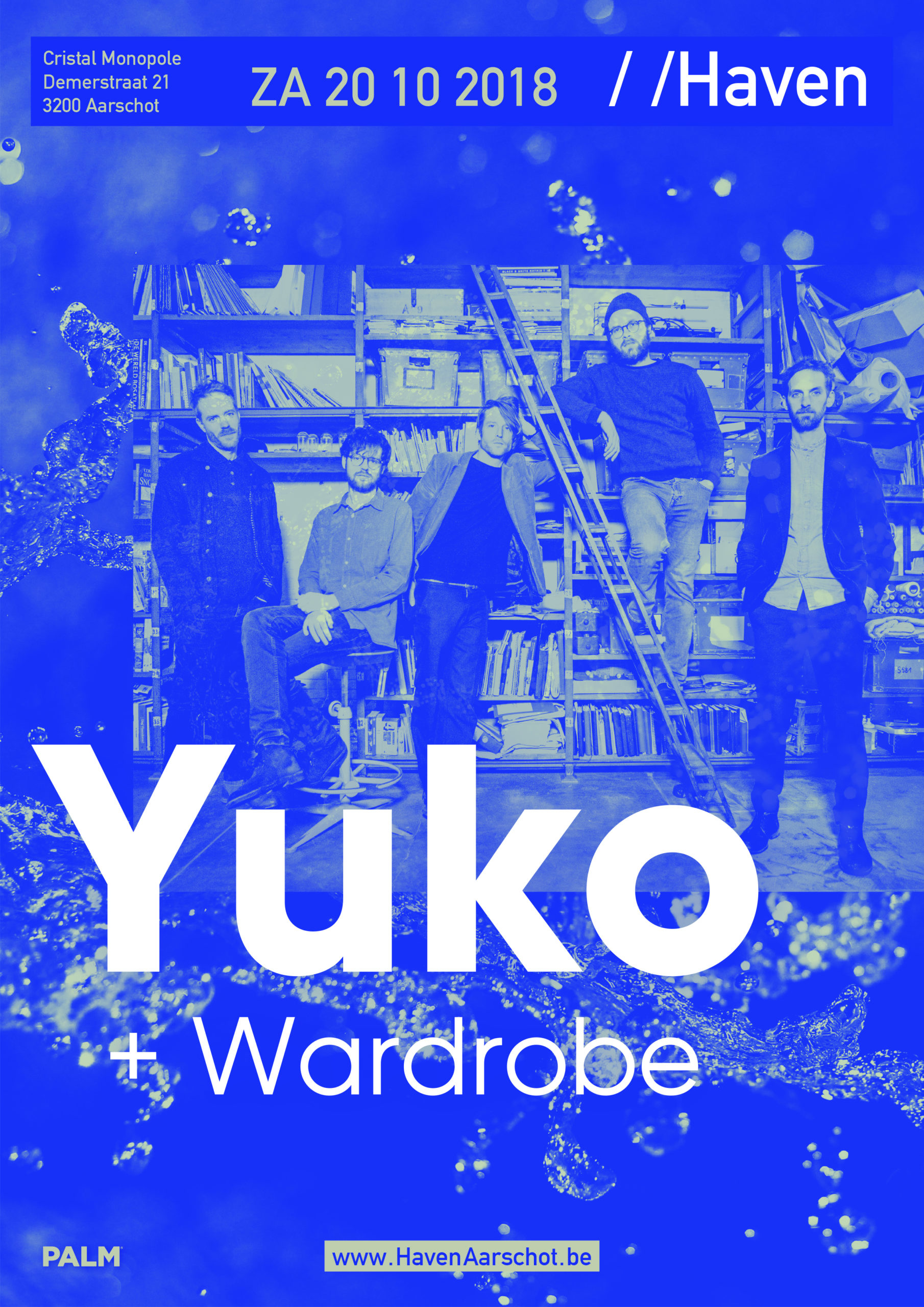
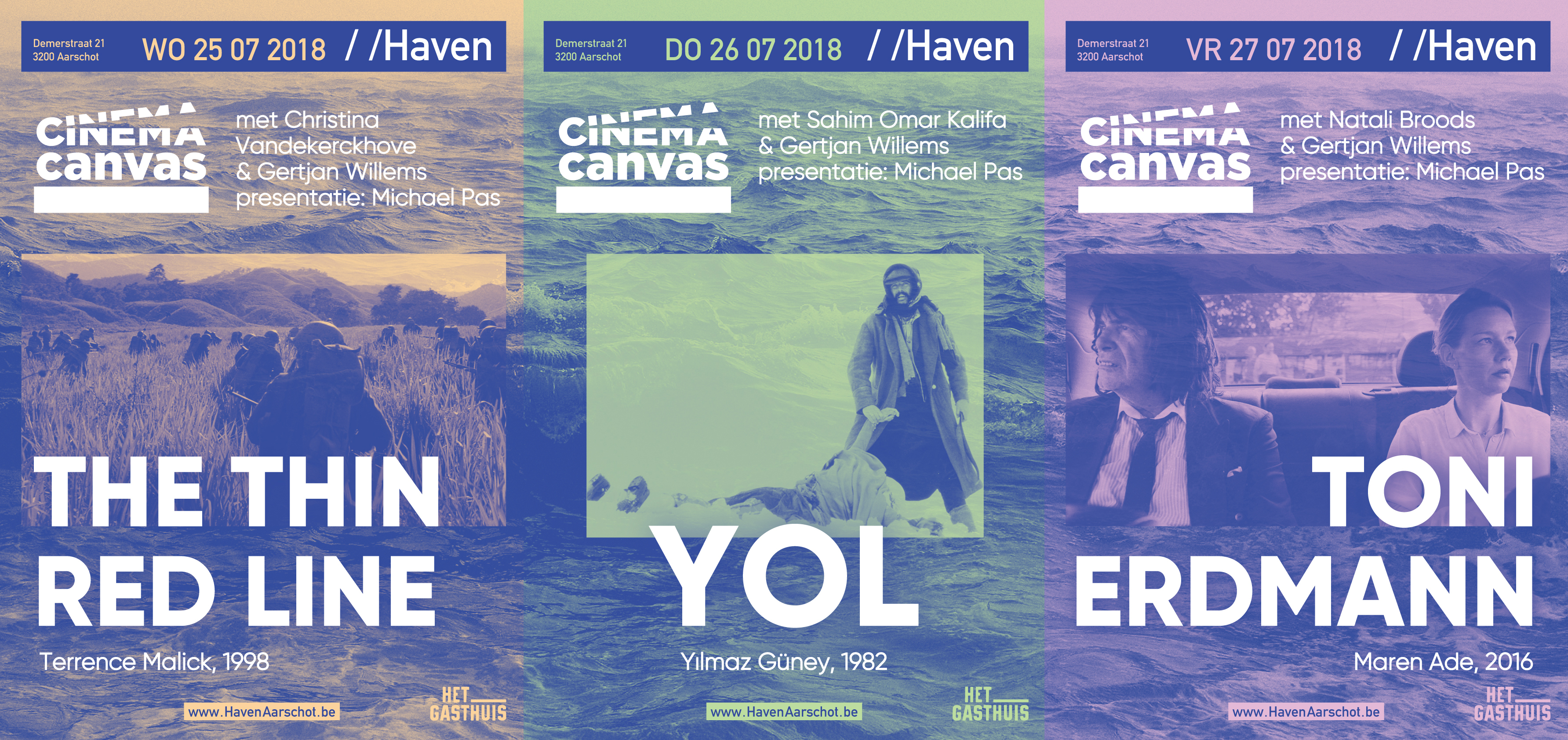
De Haven is a former water bottling plant in Aarschot that now has become a music venue / cultural centre. The logo (in white, top right of the posters) was already designed in-house, but I was asked to develop a visual style. The only request was to use a particular kind of blue and – of course - the existing logo.
'De Haven' means 'the port', so I got the idea to always incorporate a different image of water in the background, since water is what thematically connects the old purpose of the building with the new.
The design always consists of two colors: blue and one extra colour (and white). There won't be a standard grid, the lay-out will always depend on the photos being used. With the background image always changing and 5 different color combinations being used, there will be a big variety in posters, while still being instantly recognisable.
The identity design will certainly evolve over time, but I think this is a great starting point – and so did the people of De Haven themselves.


